Pie Charts
A pie chart is used to display data for comparison purposes. It is helpful in getting a rough idea of amounts, relative to one another.
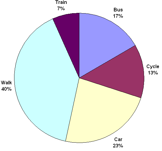
Example
Earlier we looked at an example of methods of travel (car, bus etc). If we take the same data and present it as a pie chart it could look something like this:
Pie Chart To Show Method Of Transport